The World Clock's Day/Night Map, and the Math Behind the Line
The shaded half of the map isn't decoration — it's a real, recalculated answer to "where on Earth is it dark right now," and the curve in that line is Earth's tilt, not a map projection quirk.
The shaded half of the World Clock map isn't a static graphic — it's recalculated every time the page renders, based on where the sun actually is relative to Earth at that instant.
The line curves because Earth is tilted, not because of the map
Earth's axis sits at roughly 23.44° off from its orbit, so the boundary between day and night — the terminator — isn't a straight vertical line, it's a curve that swings further north or south depending on the time of year. Near the solstices, that tilt pushes the curve far enough that an entire polar region stays lit or dark all day, which is exactly what a flat map should show when it's modeling a tilted sphere honestly.
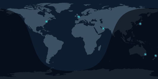
The point the sun is directly over gets recalculated constantly
Underneath the shading is one calculated point: the spot on Earth where the sun is directly overhead right now. The date gives how far north or south that point sits (the same 23.44° tilt, moving through the year), and the exact time of day gives which longitude — the sun is over roughly 0° longitude at 12:00 UTC and drifts west from there as the day goes on. Everything more than 90° away from the opposite point on the globe falls in shadow, which is the shape drawn onto the map.
What it's actually useful for
Beyond looking like an actual world clock instead of a plain list, it answers a question a raw hour number doesn't: whether a city you're about to call is sitting in daylight or the middle of the night, at a glance, without doing the arithmetic. Switch to Meeting Planner and the shading follows whichever hypothetical moment you're looking at, not just the real current time.