The Best Digital Clock Style for Elderly Family Members
Why a plain, motionless LED display beats a flip or pixel clock for older eyes — and how to set one up on a spare laptop or tablet in a minute.
When people set up a clock for an elderly parent, the instinct is usually to make it look nice — a warm color, maybe something with a bit of personality. We'd argue that's backwards. For older eyes, and especially for anyone with mild cognitive decline, the clock that works best is the one with the least going on.
That's why, out of everything on this site, we specifically recommend the plain LED-style digital clock — not the flip clock — for this use case.
Why motion is the wrong choice here
The flip clock's mechanical animation is genuinely one of our favorite features. But for someone with reduced visual processing speed, a digit that flips and briefly shows two overlapping numbers mid-motion can be momentarily confusing — you glance up, catch it mid-flip, and have to wait a beat to be sure what it says. A static LED-style digit never has that problem: it's either the right number or it isn't, instantly.
Pick the LED style, not a color that "looks nice"
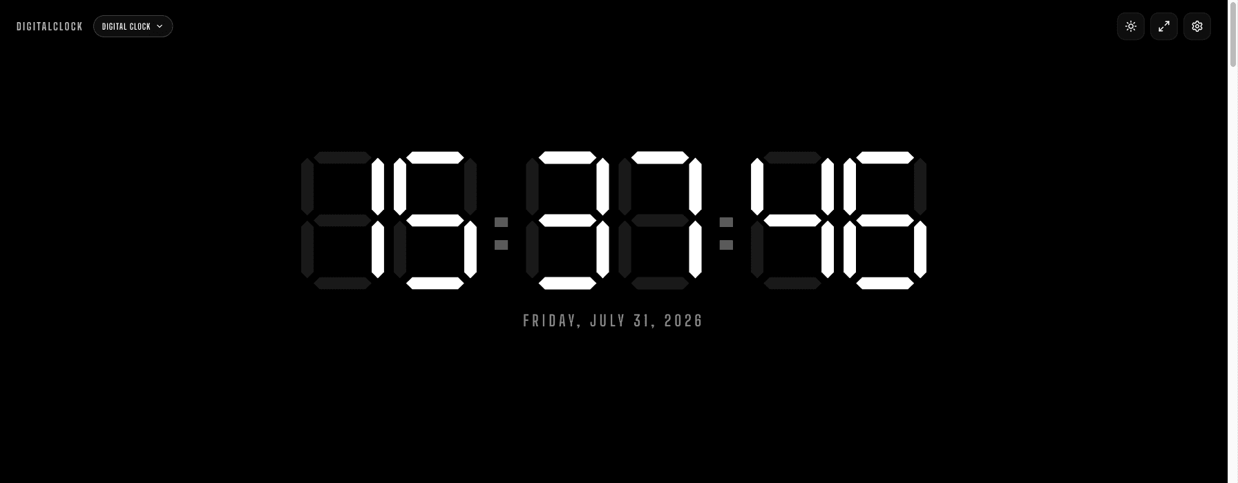
Go to the digital clock and open Settings. LED Red and LED White are the two we'd actually suggest: both are simple seven-segment digits (the same shape as a calculator or classic alarm clock), large, and free of gradients or glow effects that can blur together for someone with cataracts or macular degeneration.
Turn on the date
For a visitor with memory difficulty, knowing the day of the week can matter as much as the time itself. The date toggle in Settings adds it below the clock in the same large, plain typeface — "Saturday, June 27" — not a smaller secondary line that's easy to miss.
Set it and don't touch it again
Turn on Keep Screen On in Settings so the display never dims or requires a tap to wake up — someone checking the time shouldn't need to interact with the device at all. Then leave the browser tab open, or install it as a home-screen app (share icon → "Add to Home Screen" on iOS, browser menu → "Install app" on Android) so there's no address bar or tabs to accidentally close.
No sounds, no popups, no "did you know" tips. Just a big, still, legible number. That's the whole design brief for this use case.